GoldTent Oasis is dedicated to our friend and founder John F. Murphy (Wanka) of Key West, Florida without whom this website would not exist. Gone but never forgotten.
ENTER ~ Post by the Golden Rule. Gentlemanly conduct is the attire of the day. GoldTent Oasis is not responsible for content or accuracy of posts DYODD. ~~~~~~~
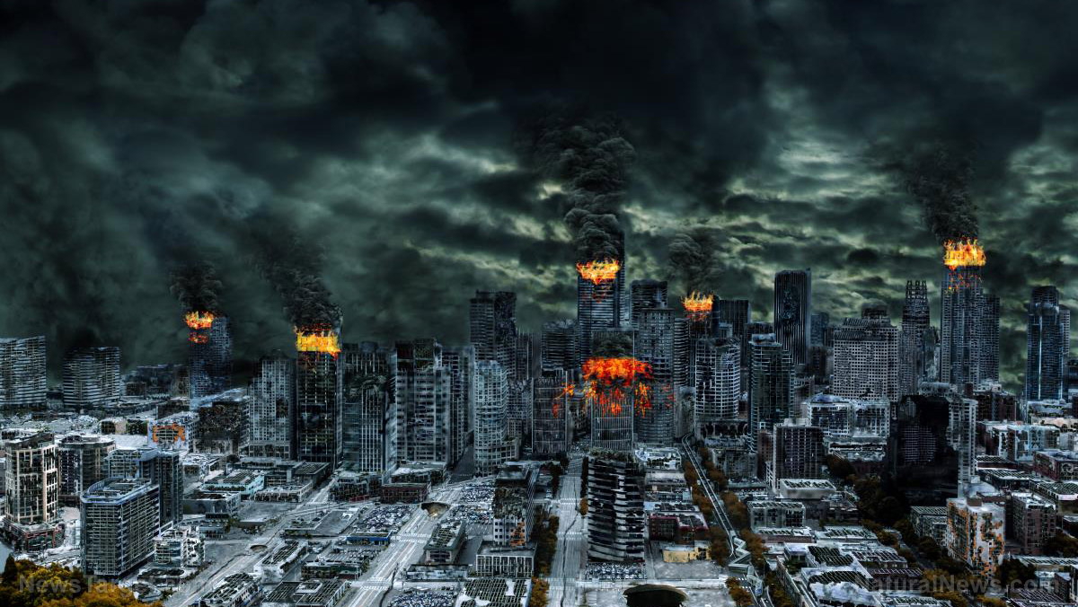
Here’s a video of a concerned cop. Thought people here knew about it but if they don’t probably best to be careful going out on that day incase any lone nut try’s something. Some are talking about planning their own resistance to these thugs but it’s probably best if they riot just left them get arrested so they can’t blame Trump supporters like the lying media will do. https://www.youtube.com/watch?v=pbmrgpQiIcQ&sns=em
There’s a rumor going around that ANTIFA is planning a riot on Nov. 4th ” correction. Maybe it’s the Gov planting the rumor lol Orr maybe their practicing for it. Lol
And now, a headline you NEVER thought you’d read: Despot Robert Mugabe is appointed a ‘GOODWILL ambassador’ by the World Health Organisation – after life expectancy in Zimbabwe plummets under him
Robert Mugabe has been controversially appointed as health ambassador for the World Health Organisation.
The 93-year-old president of Zimbabwe – who oversaw plummeting life expectancy in his own country – will supposedly co-ordinate the United Nations organisation’s battle against heart disease, cancer and diabetes across Africa.
The role – which comes with the title of ‘WHO goodwill ambassador’ – will be to encourage African governments to introduce policies to reduce smoking and drinking, improve diets and increase exercise.
Walter Mzembi, Zimbabwe’s foreign affairs minister, said the appointment was a ‘major diplomacy coup’ for the country and claimed Mugabe is ‘very passionate about non-communicable diseases’.
The smart thing about Trumps intention on lowering taxes as it defies buy the rumor sell the news. Everyone wants to get in expecting the news while congress drags its feet on it but instead of getting ready to sell before the news they expect it to be bullish for stocks. Then without it the Fed backs off on interest rates. The only negative. Just how much will they take without any action I don’t know.
As central banks pretend stocks will stay elevated without the cocaine of additional QE, here is the WTF? chart of 2017.
Mania In Full Swing
By Peter Boockvar, author of the Boock Report
October 20 (King World News) – Here is what Peter Boockvar wrote as the world awaits the next round of monetary madness: Here is a chart of the Russell 2000 since the beginning of 2017 in yellow with earnings estimates for the components (see chart below).
WTF? Earnings estimates tumbling (white), while stocks soar (yellow)
I agree on stops. They can see them and will do just that, take them out before a rise. Ya long tail down. However when the crash of around a month 08 hit and was nervous with the charts looked like it was coming I used them and since I was at work it saved me. Came back home thought WTF just happened!! I thought of borrowing my own stocks for that but just didn’t know enough of all the tricks involved to watch to do it but if I did I would of used them till I learned more.
PS long tail downs usually happen at the bottom not after the run already in place.
The global ecosystem is rapidly collapsing… insect biomass plummets 75% in one generation… scientists warn of “decimation”… humanity may not survive much longer
(Natural News) For years, I’ve warned that humanity is a suicide cult which has engineered its own destruction by relentlessly poisoning the natural world with chemical pesticides, heavy metals and GMOs. Now, the collapse of living systems across the planet is accelerating like never before, with ocean fisheries collapsing by the day, topsoil vanishing by the inch, and wildlife populations being decimated by the accelerating destruction of habitat.
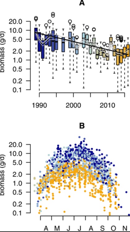
Humanity, it seems, has broken the planet, and the mass die-offs are now impossible to ignore. Adding even more weight to the horrifying realization that humanity is committing mass ecological suicide, a new study published in the science journal PLoS One has documented a 75 percent decline in insect biomass over rural Germany in just the last 27 years.
The abstract of the study, which should be screaming alarm bells over the devastating collapse of the food chain in Europe, reports rather mildly:
Our analysis estimates a seasonal decline of 76%, and mid-summer decline of 82% in flying insect biomass over the 27 years of study. We show that this decline is apparent regardless of habitat type, while changes in weather, land use, and habitat characteristics cannot explain this overall decline. This yet unrecognized loss of insect biomass must be taken into account in evaluating declines in abundance of species depending on insects as a food source, and ecosystem functioning in the European landscape.
Even more concerning is the fact that this insect decline was observed in “protected areas” that are supposed to preserve and protect wildlife. As the study authors explain in their conclusion:
The widespread insect biomass decline is alarming, ever more so as all traps were placed in protected areas that are meant to preserve ecosystem functions and biodiversity… our results illustrate an ongoing and rapid decline in total amount of airborne insects active in space and time.
The food web is now collapsing… insects are just the beginning
The stunning news of this insect biomass collapse is, of course, just the beginning of a series of events that will ultimately spell doom for humanity unless causative factors are quickly reversed. Insects are the pillars of the food web, providing protein and nutrients to bats, birds and reptiles, among other animals. When the insect population collapses, nutrient depletion cascades up the food chain, causing devastating declines in populations of larger animals upon which ecological diversity depends.
As the study authors explain:
[The insect biomass collapse] must have cascading effects across trophic levels and numerous other ecosystem effects. There is an urgent need to uncover the causes of this decline, its geographical extent, and to understand the ramifications of the decline for ecosystems and ecosystem services.
Even more worrisome, insects are the pollinators that keep 80% of wild plants alive by facilitating pollination. When insect populations collapse, pollination of wild food sources — as well as many domesticated food sources such as almonds — also face imminent collapse. Without insects, in other words, human populations will also collapse within just a few years as the ripple effect of insect die-offs works its way up the food chain.
The rapid timetable of this collapse is nothing short of alarming, if not catastrophic. As the chart shows, below — sourced from the PLoS One journal article — the biomass decline from 1989 to 2016 is catastrophic. The second chart, below, shows how insect biomass loss is even more pronounced during summer months:
Warming temperatures actually increased insect biomass, so this isn’t a “climate change” problem
The study carefully documented variations in temperature, wind speed, humidity and other environmental factors in an effort to determine root causes of biomass variance. Interestingly, the study was able to determine that warming temperatures did not reduce insect biomass. In fact, the warmer the temperature, the more insect biomass was measured.
In other words, “global warming” actually increases insect biomass, so this is one phenomenon that can’t be blamed on the climate change hoax. From the study results:
Over the course of the study period, some temporal changes occurred in the means of the weather variables (S2 Fig), most notably an increase by 0.5°C in mean temperature and a decline 0.2 m/sec in mean wind speed. Yet, these changes either do not have an effect on insect biomass (e.g. wind speed) either are expected to positively affected insect biomass (e.g. increased temperature).
The conclusion of the paper specifically rules out “climate change” as an explanatory factor, saying, “…[O]ur analysis renders two of the prime suspects, i.e. landscape and climate change as unlikely explanatory factors for this major decline in aerial insect biomass in the investigated protected areas.”
In fact, the paper points out that warming temperatures are actually saving the insects to some degree by compensating for some other factor that’s killing them off:
Our final model, based on including all significant variables from previous models, revealed a higher trend coefficient as compared to our basic model (log(λ) = −0.081, sd = 0.006, Table 4), suggesting that temporal developments in the considered explanatory variables counteracted biomass decline to some degree, leading to an even more negative coefficient for the annual trend.
Insect biomass “decimated” in mere decades… this won’t end well
The study authors were unable to pinpoint a specific cause for the collapse of insect biomass, but that’s likely because they did not measure pesticide exposure, GMO pollution or other chemical contaminants that severely impact insect populations.
Even without that knowledge, the study authors concluded the rapid decline in insect biomass was catastrophic:
Our results demonstrate that recently reported declines in several taxa such as butterflies [7, 25–27, 58], wild bees [8–14] and moths [15–18], are in parallel with a severe loss of total aerial insect biomass, suggesting that it is not only the vulnerable species, but the flying insect community as a whole, that has been decimated over the last few decades…
The authors also affirm they are aware that pesticide exposure could be one of the plausible explanations for the collapse, stating:
Agricultural intensification (e.g. pesticide usage, year-round tillage, increased use of fertilizers and frequency of agronomic measures) that we could not incorporate in our analyses, may form a plausible cause. The reserves in which the traps were placed are of limited size in this typical fragmented West-European landscape, and almost all locations (94%) are enclosed by agricultural fields.
Intensive agricultural practices, in other words, are a primary suspect in this devastation of insect populations. And that points directly to pesticides and herbicides — chemical poisons that are developed specifically to kill living things.
Unless something changes, humanity won’t even survive long enough to cause sustained global warming
All this brings me to (at least) one obvious point: While the left-wing media and science talking heads are losing their minds over so-called “climate change” — an entirely made-up problem — even their own predictions only show tiny increases in ocean levels over the next hundred years.
Yet the collapse of insect populations is happening now, with devastating consequences already initiated that may spell doom for a global human population of over 7 billion people, all of whom demand food on a regular basis. Without insects, the food supply collapses. Without food, human populations collapse. And without humans, there is no sustained global warming problem to worry about anyway.
In other words, climate change alarmists are focusing on the wrong crisis. If we don’t figure out what’s decimating the insects — and it’s very likely agricultural chemical contamination of our world — then nobody will be around to burn fossil fuels and run the coal plants anyway. Global warming, in other words, is not a problem if everybody dies from starvation because the global food web collapses.
Climate change cultists are ignoring the real problems that threaten all of human civilization
Yet isn’t it fascinating how the entire climate change cult that demands totalitarian control over our lives in order to “save the planet” absolutely refuses to acknowledge any consequences whatsoever from agricultural pesticides and GMO genetic pollution? While the natural world is collapsing around them, all they wish for is more power, profit and control over nations and economies.
These science imbeciles are ignoring the real causes of catastrophic collapse, all while patting themselves on the back and proclaiming they are the science saviors of our world: Al Gore, Neil DeGrasse Tyson, Bill Nye and other climate change cultists who typify the idiocy-celebrity status of those who hide behind fake science to portray themselves as Christ-like saviors for a world that’s crumbling for reasons they absolutely refuse to acknowledge.
That’s why I’ve dubbed humanity a “suicide cult.” No one in a position of power cares about anything other than their own fame, fortune and perceived brilliance. No one in a position of authority has any empathy or compassion for preserving the natural world and its essential ecosystems. Every sector of politics has been exploited, distorted and reformed into idiotic propaganda parades featuring a steady stream of academic morons who reject scientific reason in favor of political obedience and left-wing conformity.
Consequently, “science” is dead. And soon, unless something drastically changes, humanity will be too.
Good points. But too complicated for most people. Some people say you should not make taxes a deciding factor. I’ve seen so many people avoid profits, to avoid taxes, and later on their investments so sour, and lose the profits to Mr. Market instead of uncle Scam.
They just process words ….mostly evident in the Universities where they are intimidated by Professors that threaten with Bad Grades if they dont conform… What does this chart mean to you ? JUST look at my prior post below as an example ..
all those machinations you talk about are a recipe for a CURRENCY CRISIS ! A run on the DOLLAR a collapse ! everybody loses…in the short run then Gold will be used to restore order and BIT COIN used to keep money out of the Politicians hands ..
only Gold and Bit Coins …both did well today….There are few buyers around to buy anything …its a nervous market awaiting a Black Swan event ..probably a Trade Dispute with Mexico,Canada,China ,Germany and all the rest that have been sticking it to America for too long.all the Socialists so called FRIENDS of America….ALL its going to take is for Menuchen to say the magic word ..Devalue or let the Dollar Float ! Everybody will run to cash out and raise CASH…….In which case where will the Cash go ..Gold or Bit Coin ? NOBODY trusts their Government ! China is Paranoid about BIT COIN ….no government Controls BIT COINS can leave CHINA with a Currency EXODUS that will Spin their heads backwards ..Its Chinas biggest fear… No Capital Controls will destroy China and at first be a boon to HongKong ,Taiwan and Macau …Then China will crack down on them and its all over for China……India will be our next best Friend if they can get their act together ..Russia is playing it cool ..just buying commodities as they always have done ..Its a resource based economy like Canada and Australia ….not a paper economy…Everybody that understands the VALUE of BIT COIN even Banks are moving in that direction. as is Russia ….NOBODY trusts Politicians with their money or Banks for that matter ..
I pity the FOOL that runs a bank and says go cashless thinking that Banks will benefit….To me “cashless means GOLD SILVER & BIT COINS”
The Mechanism itself has taken charge and is now increasing, automatically, what is on the Fed’s books. The Fed is not making any decisions, and cannot make any decisions. The Mechanism has taken over. The United States Government is now an automatic bankruptcy Court, making visible what has been known for a long time: the United States Government is bankrupt. Meaning that it is not governing the country anymore. Meaning look elsewhere.
check and mate, the Fed has so many more tools, the discount window POMO and TOMO, the only problem is they are only pale cousins of the real thing (QE) or QaE, Future Qualitative Easing, will Trump order Yellen to buy stocks? Well Reagan sent Bush down to the NYSE in 87 with an open checkbook.
In non crisis mode it is enough to keep the liquidity they have already put in the market circulating until the leadership has made its way to an undisclosed location.
Why do you need to buy stocks when you can keep zombie companies afloat, and keep their stock prices up (so executives can cash in), simply by making cheap loans available and then scooping up the bonds.
Part of the response to the 1929 crash was NEVER again to have the U.S. Government, or anyone else, being in the position to say Yes or No to bailing out the stock market directly. That’s what this hall of mirrors is all about.
Free money ? ..theres no such thing ! and I never use stops …Its been my experience just before a rise takes place ..they take the stock down and clear out all the stops before taking it up ..Your just giving them your stock at a discount ….Keep a Mental Stop if you must and do it ..That way your not signaling “come and take me out” ..before they take it up…Its called “running the stops” amateur hour !
On the same exact day, stocks, bonds, real estate and bit coins will crash, and evaporate everyone’s play money. But nobody knows when.
Anybody sitting on $1 mill profits today should probably cash out at least half. If I was sitting on one million? I’d cash it ALL out and relax. How much more do we need? At our age it all gets left behind for the kids.
the thing that keeps me in after these many years of pain is knowing that the day I sell out of my PMs and buy the DOW, will be the exact day that they both reverse.
It was definetly going to happen in Oct, now its jan01, when that comes and passes it will be the spring etc etc. If gold does ever break through it will probably be the end of life as we know it.


 Its clear people dont know how to THINK !
The Mechanism itself has taken charge and is now increasing, automatically, what is on the Fed’s books. The Fed is not making any decisions, and cannot make any decisions. The Mechanism has taken over. The United States Government is now an automatic bankruptcy Court, making visible what has been known for a long time: the United States Government is bankrupt. Meaning that it is not governing the country anymore. Meaning look elsewhere.