
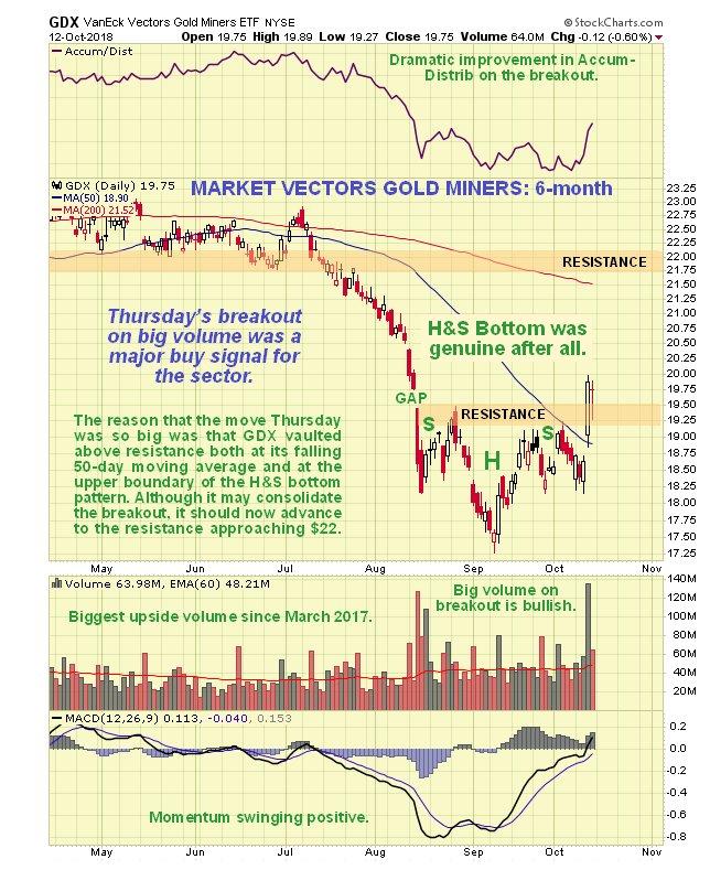
Now we come to the PM stocks’ big breakout on Thursday, which we will examine on the chart for GDX. Whilst we certainly recognized that the pattern forming in GDX was a potential Head-and-Shoulders bottom, we remained suspicious of it right up until the breakout for two reasons. One was the unfavorable volume pattern whilst it formed resulting in a weak accumulation line (which was also the case with gold and silver), and the other was the fear that PM stocks might be taken down by a crashing stockmarket – but happily the opposite seemed to be the case, with PM stocks seemingly thriving on the general mayhem – and why not? – as the most unloved sector around for years it’s time for a change of fortune. In any event, as you can see, what must have been an internal improvement ahead of the breakout was heavily camouflaged, which was why we didn’t buy ahead of it, but the big volume on this breakout, especially in GLD, means that it should be “the real deal” and not a deceptive pop, especially as it happened when the broad market tanked.
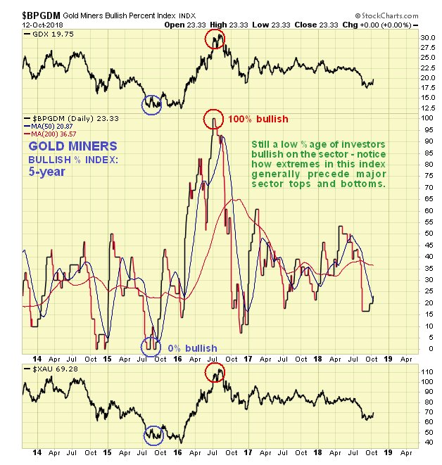
The latest chart for the Gold Miners Bullish % Index shows that there is still a low percentage of investors bullish on the sector, which is of course positive…
****************************************
Let’s now review the charts to assess the significance of Thursday’s breakout. We start with gold where we see on its 6-month chart that it staged an impressive high-volume breakout from a rectangular trading range that formed following the low in mid-August. Right up until the breakout the pattern was ambiguous with the price being pressured by the falling 50-day moving average, so that it could easily have broken down again. Thus this big up day, with the price breaking clear above not just this average but also the resistance at the top of the pattern, was certainly an event of significance. The minor reaction on Friday is normal and provided us with an opportunity to pounce on the sector, having grasped the magnitude of Thursday’s action.We don’t need to dwell much on the latest COT chart for gold, beyond pointing out that it is the most bullish COT we have seen since 2001, with the dumb Large Specs actually shorting gold to a significant degree as of last Tuesday night. A chart like this means that gold has the potential for huge gains from here.